Ordinary Duotone
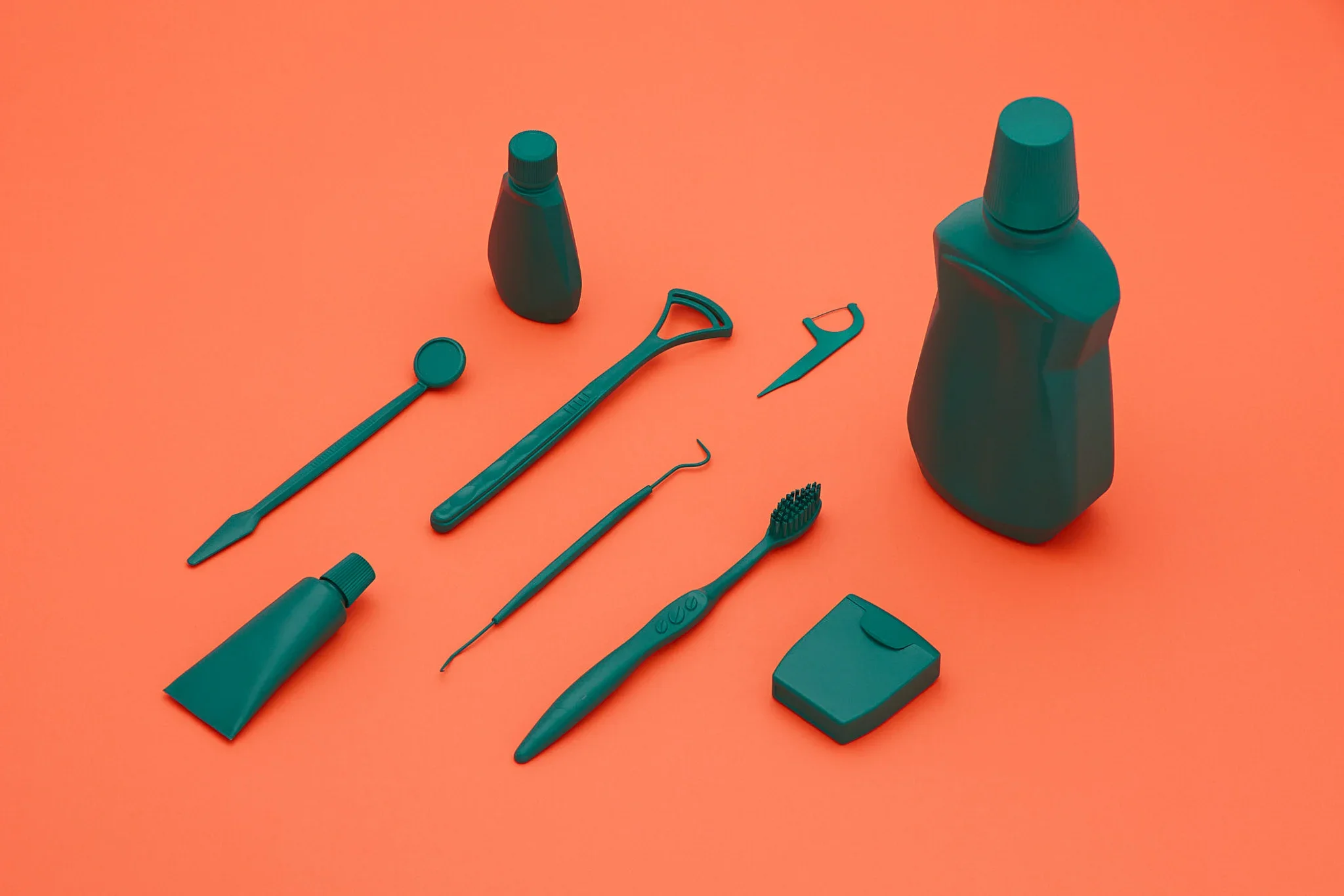
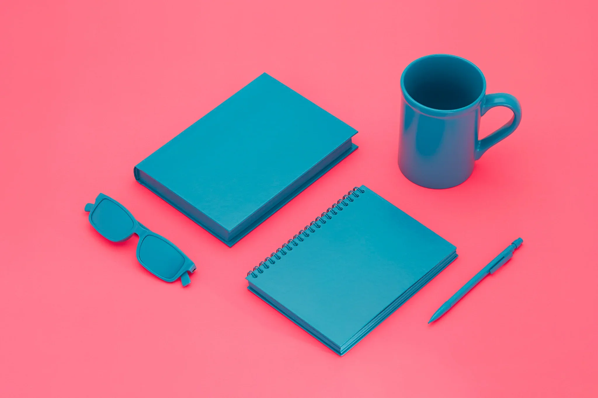
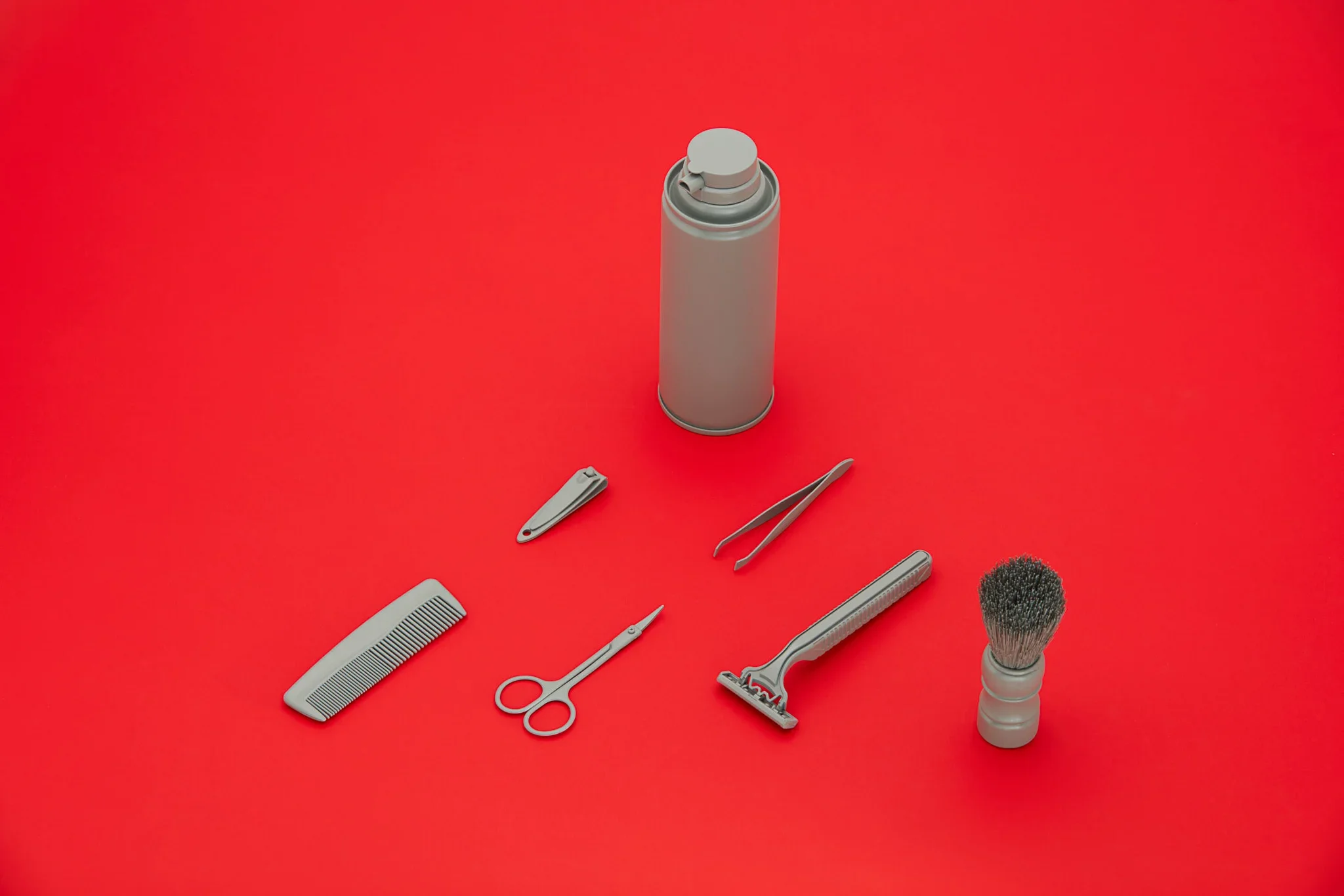
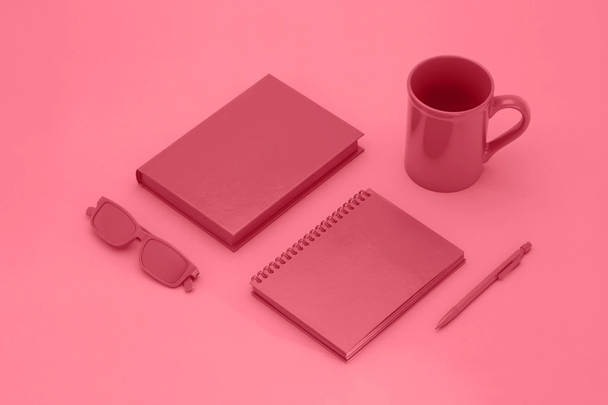
For this project, I set out to photograph mundane, everyday objects using a controlled, duotone color palette. The goal wasn’t just simplicity, but reduction—stripping the scene down so color and form carried most of the visual weight.
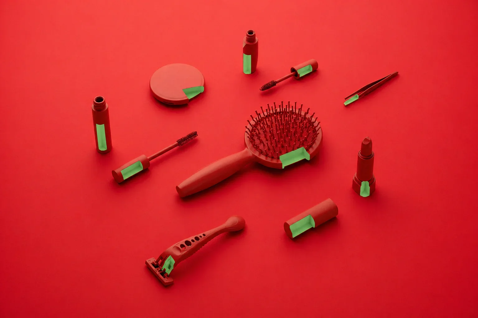
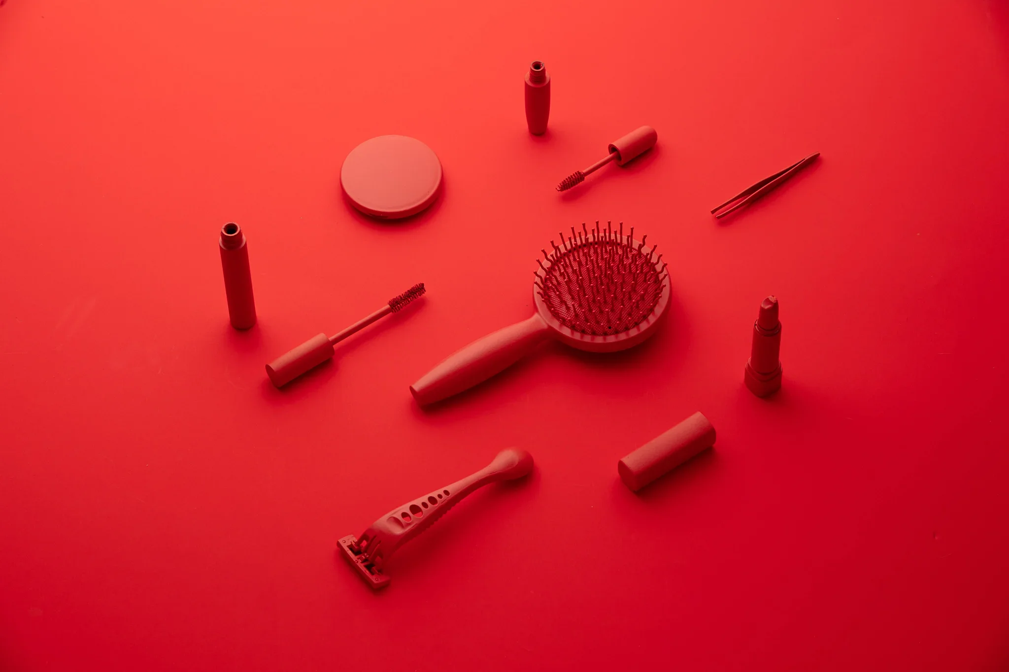
I experimented with a few variations early on, testing different color relationships and object groupings. In the end, the fully red composition stood out the most. There was something about the uniformity that I really enjoy.
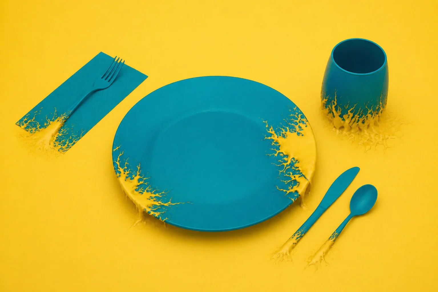
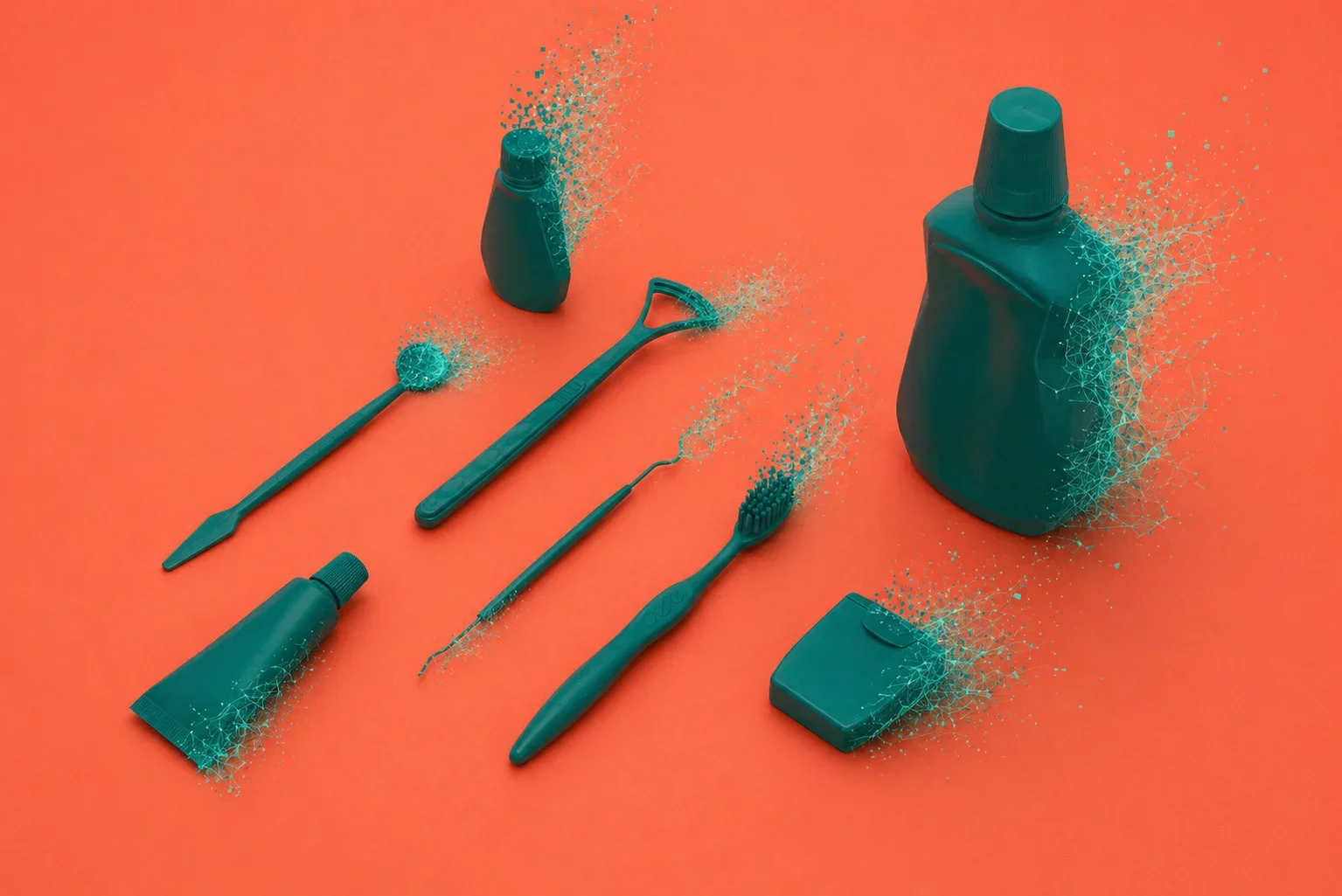
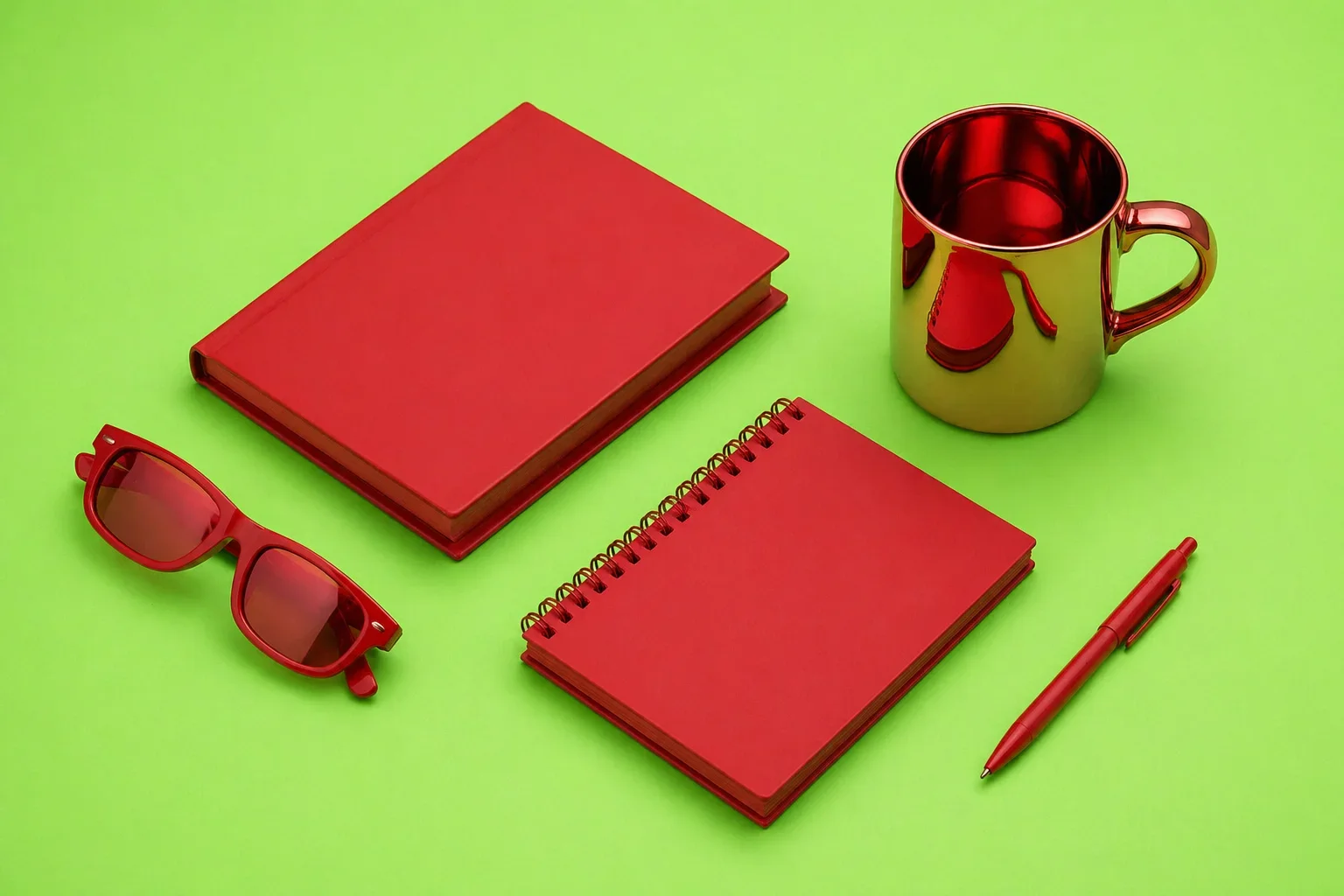
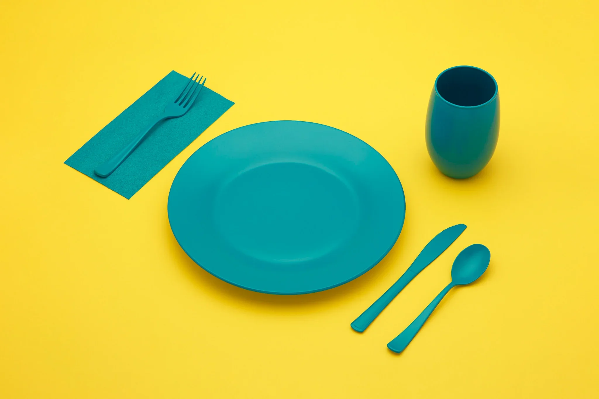
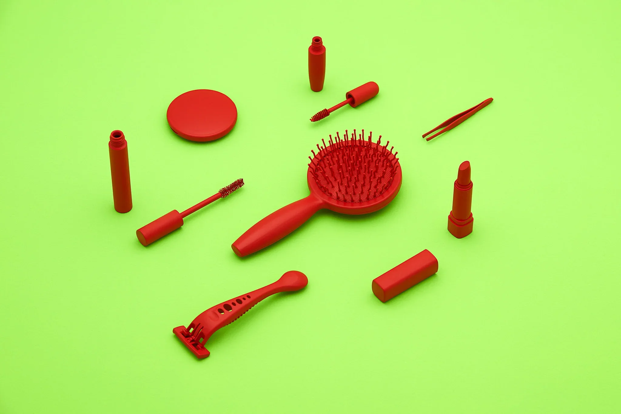
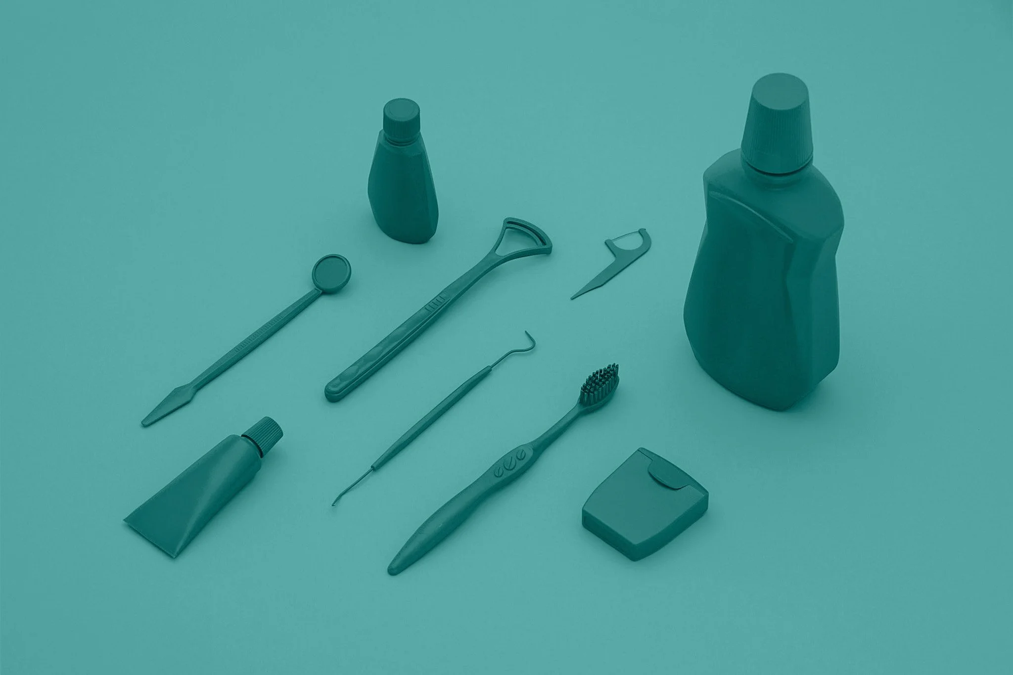
At the same time, I didn’t want the series to feel completely static. To introduce contrast without breaking the minimal approach, I shifted into using complementary colors. I painted the objects in a single dominant color and placed them against an opposing color background. This created separation while still keeping the frame clean and controlled.
From a technical standpoint, the lighting played a key role in maintaining that balance. I kept it directional but soft, allowing for gentle falloff and controlled shadows so the texture and edges of the objects didn’t get lost in the color. The idea was to preserve form and dimensionality, even within a limited palette.
Overall, the process became less about the objects themselves and more about how color, light, and composition interact when everything unnecessary is removed.
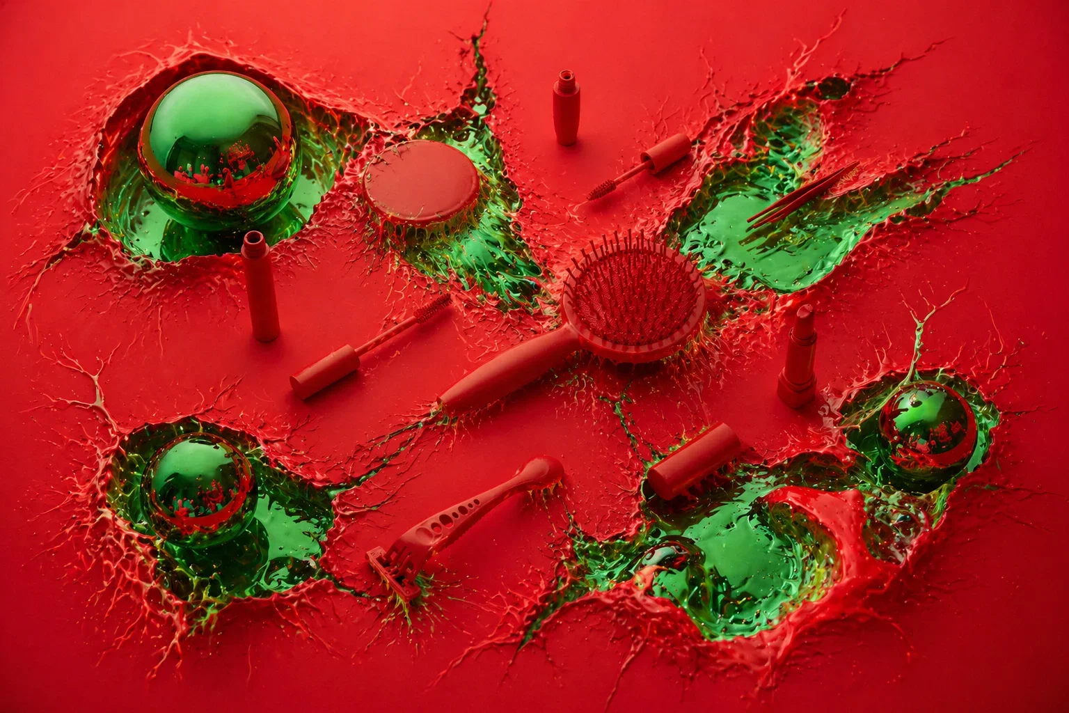
For the images below, I ran them through an AI image generator and modified them. I used different prompts for different results as I wanted to play around with modifying my own images with very abstract commands. As you can see, the first image was essentially cutouts. The second image is a more organic feel like the yellow is taking over the third is somewhat of a dissipating or fading electrical signal and the fourth one was reflectivity on something that really didn't make any sense. The last one was just a big mishmash of a bunch of different techniques. Overall, I think they came out pretty cool and definitely learned some new prompting techniques.